
The Canadian brand has received a makeover thanks to a cross-border effort by Public Radio International and CBC Radio Q. The creative challenge was based on this question: how would you go about redesigning Canada and the United States? CBC Radio Q was in charge of redesigning the U.S. and did so by examining different aspects of the country each week, such as; their international image, their political rhetoric, the character of the country, and the American Dream. For the full results of this exercise in branding the U.S. click here. According to Susan Delacourt from the Toronto Star, NPR enlisted the help of internationally renown firm, Bruce Mau Design (BMD), for its part in the exercise.
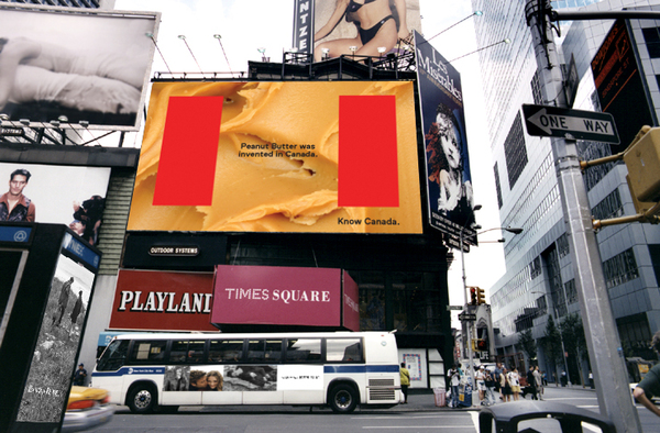 |
| This is an example of how the "Know Canada" campaign could be implemented (Bruce Mau Design). |
The firm intends to bring this campaign to politicians in Canada, in order to see if they can develop the rebranding exercise into a full-fledged effort. The Toronto Star article argues that this is going to be an issue because the Conservative government will have no interest in rebranding images that it embraces. Another point of contention, according to the article, is that the logo design focuses on the iconic red colour, which is often associated with the Liberal party. It's a shame that this is likely true because the symbols which used to define Canada no longer do. These icons are part of a country that no longer exists in the form that it once did and serve to undermine any progress the country has made in the last decade. A modern image that reflects its population would serve Canada much more proudly than out-dated symbols are able to.
 |
| NPR enlisted the help of its listeners to create a six-word tagline for Canada. After more than 750 submissions this slogan by David Fuller from Winnipeg was selected (Note the image is missing part of the slogan which reads: Canada: We're not just colder, we're cooler). |
The cross-border exercise was an interesting one because it showed how Canadians thought Americans could improve their image and vice versa. The emphasis that today's generation places on branding is unprecedented. Redesigning Canada would benefit the country by better explaining to the international community what it stands for. Canadians would feel better represented and the improvements and advances that Canada has made would be reflected properly. The country could have a healthy relationship with its past by placing a real emphasis on the present state of Canada. Ideals which the country stands for are still present but they aren't being explained in a way that today's Canadians deserve. If we place such importance on personal branding and a company's image, why not do the same for the place we call home?
No comments:
Post a Comment